Welcome to my Portfolio

UI/UX Design, Creative Strategy & Leadership

About me

I'm a UI/UX Designer and Creative Director that can own, lead and most importantly do everything in the creative cycle. From brand nurture, to digital and print design, to campaign generation and creative marketing strategy. I've held creative positions in-house (9+yrs) and agency-side (4yrs) in B2B and B2C industries and I have built and managed successful teams and projects for start-ups, SME's and enterprises globally. I am lucky enough to have worked with hot tech start-ups such as MIRACL and CertiVox, through to established behemoths such as Apple, CA, SAP and Iomega.

In my career to date, I have managed teams and projects, big and small. I have been asked everything from designing a 72ft banner to wrap around a stadium, to adding nipples to an illustrated company brand character. Anything from digital to print, I'm happy to own and nurture.

My education includes Fine Art BA (HONS) Degree, Graphic Design Higher National Diploma (Distinction), and successful completion of the Key Manager Programme, City and Guilds from The Institute of Leadership and Management at Westminster. As well as running my own classes to educate adults and young learners in the methods and best practice of Graphic Design.

Download My CV

MY EXPERTISE
UI DESIGN
  • Brand identity and messaging
  • Digital: Web, Apps, Email, Presentations
  • Print: Brochures, Exhibitions, Adverts
  • Adobe CC, HTML and css coding
User Experience
  • Storyboarding and user flows
  • Wireframing and site maps
  • User research and testing
Growth Hacking/Marketing
  • Content strategy and SEO
  • PPC/Adwords/Social Advertising
  • Reporting and analytics
  • Social media development
Strategy
  • Marketing plans and campaign development
  • Sales enablement
  • Stakeholder/investor relations
  • Developing partnerships
  • Build and mentor creative/marketing teams and manage freelancers/PR/Writers
This is me - IT worker

Skills

User Experience

In order to deliver a brilliant design that not only fits the brief but also exceeds expectations, the right questions need to be asked first and answered along the way. Analysing the journey, customer expectations and how to achieve the objectives with a simplified and enjoyable UX is any designer's quest. And turning that into a beautiful yet functional UI is the unicorn.

Design

Originally trained as an artist, I started my career in graphics as a web designer. My expertise has since branched into every aspect of user interface design from web to mobile, to print to video. I have dabbled in a lot of applications beyond my beloved Adobe Suite, and I'm always happy to pick up new ones along the way.

HTML/CSS coding

Whether it be a cutting edge responsive HTML5 template, to a compliant and functional HTML email built with dreaded tables, I've coded it. From CMS systems like Wordpress and Squarespace to CRM systems like Salesforce, to Marketing apps like Hubspot and Survey Monkey, to Social Sites like Facebook and Twitter... I've worked with it and pushed it to its limits.


Sounds good huh? Would you like to know more...

Contact me

Testimonials

Here is some nice stuff folks have said about my work and working with me.

80
Websites
60
Satisfied Clients
200
Projects
50
Magazines and Brochures

My work

I have worked on dozens of projects so I have picked only the latest for you.

×

MIRACL

Digital Identity

MIRACL is a cyber security start-up that secures the people, apps and things needed to run a digital business. Using a zero-knowledge proof, they eliminate out-dated security practices in business infrastructure, including passwords, root keys and stored credentials. They have developed a single security platform, which enables nearly every part of a digital business, from web and mobile applications, to the internet of things, the enterprise blockchain, and public/private cloud environments to have true two-factor authentication. Their competitors are established security practices such as RSA, Onelogin and Gemalto. As an early stage start-up MIRACL needed to appeal to enterprise customers namely those in the financial and government sector to secure future contracts. As a start-up the challenge was to look like a trusted business partner on a large scale, and as a reliable thought leader in the industry.

I was responsible for leading all creative decisions going forward. My first task was to ensure that the MIRACL messaging was reflective and durable to mimic the business plan and strategy going forward. I worked with the C-Level team to have an impact on where the business strategy should be heading based on business research and marketplace analysis. From here, I worked closely with the sales team and covered all aspects of marketing, UI and UX, to also map out the marketing and sales cycles, the processes involved and the deliverables for each stage of the process. I also mapped out customer personas and identifiers to aid the sales team with the hierarchy of decision makers vs. influencers vs. point of contact, and what tools and solutions each persona would need addressing. I would run weekly company meetings with the C-level and sales teams to introduce new procedures, processes, research and analytical findings going forward each week to strengthen awareness and streamline process.

From a marketing and creative standpoint, I created and owned everything from the logo design and brand, to printed collateral such as white papers and data sheets, to website and digital platform identity and development. I would run the website, social platforms, forums, as well as investing time and money into PPC campaigns, namely adwords and LinkedIn, and I would ensure in-depth analytical reports with growth margins on performance, optimisation, visits, views, conversions and leads were completed and shared with a simple monthly summary that I would compile and compose. When it came to campaign management and conversion optimisation I would implement growth hacking strategies and formulas based on our channel focus to achieve our marketing and sales goals.

MIRACL

Brand Identity

MIRACL is a cyber security start-up that secures the people, apps and things needed to run a digital business. Using a zero-knowledge proof, they eliminate out-dated security practices in business infrastructure, including passwords, root keys and stored credentials. As a start-up the challenge was to look like a trusted business on a large scale, and as a reliable thought leader in the industry.

I was responsible for the creative brand conceptualisation and implementation for MIRACL. As one of the strengths and key differentiators of MIRACL is the idea of 'distributing' and then combining elements to 'complete' the challenge of the software, I wanted the iconic 'M' to be 'distributed' but not so much that it was not legible. To convey the idea of breaking things up and recombining them as the software service did. I chose blue and grey as the corporate colours as blue subconsciously signifies 'trust' and 'serious'. I created MIRACL brand guideline documentation, product branding for the software called 'Trust', where I flipped the MIRACL 'M' 180 degrees, and created a tick icon to signify product approval.

From the brand I could then create various print collateral such as white papers, data sheets, customer snapshots, case studies and other resources for the sales toolkit, and digital collateral such as corporate and investor presentations (PPT).

Apple

Apple Education Campaign

Apple worked in partnership with Eteach to promote directly to those in the education sector. As part of the great offers section, Apple had their own campaign area on the eteach website which adhered to their brand identity, to promote education offers to teachers and students. The webpages needed to work as a concise portal which would navigate and redirect users to core areas on their website. In addition, I created email campaigns that helped to boost awareness and promotion of the various Apple offers.

I was responsible for initial conceptual design, HTML/CSS cutup and build ensuring browser compatibility and driving an email branded campaign to match and suit messaging and PR.

The Lightbox

Exhibition Banners for Gallery

The Lightbox Art Gallery in Surrey required designs for large external banners to be hung outside the gallery to promote the 'Visionary Victorian' Exhibition for the duration of the show.

I designed 2 x banners to be displayed outside the Lightbox Art Gallery in Surrey to promote the 'Visionary Victorian' Exhibition, the banners were designed in InDesign and needed to adhere to certain brand guidelines as specified by the gallery. The banners required were one horizontal design and one large vertical design. These large banners were then hung on the exterior of the gallery to promote the exhibition to passing traffic.

Iomega

Partner Portal and Email Campaigns

Iomega required a new Partner Portal that would work in cohesion with their Iomega main website. In addition to this, Partner emails were a key requirement to generate customers and purchases of the new Iomega Product base in Europe. A key feature on this site was the language option, which had to be considered in the design.

Ioclub was the Partner Portal part of the Iomega website, available on an international basis, a core element was the translation tool, ensuring all graphical elements could be translated to partners all over Europe. The Partner Portal needed to provide resources, training, contacts and product information whilst retaining the Iomega corporate branding. In addition there were monthly email campaigns and banners that coincided with new product launches and costing's, again these had to be produced and distributed in multiple languages.

I was responsible for design and build of Ioclub - Iomega Partner Portal. Working with the Iomega Brand centre and marketing team to ensure the corporate guidelines were consistently met and equally challenged when required. Designing site pages and functionality, HTML/CSS cutup and build ensuring compliancy and browser compatibility. In addition I managed and worked on the email campaigns (on a monthly basis), banner advertising campaigns and mailshots.

SAP

Sales Cycle Navigator

SAP needed a tool that could help deliver training and ensure sales protocol was meet by their partners and resellers. This became the Sales Cycle Navigator Tool, which worked as a member area that guided the user through the sales process to ensure that a successful sale was achieved. This site worked in cohesion with other small sales tools that guided the user to completion. SAP required various web enhancements from the core project of developing and implementing the 'Sales Cycle Navigator', to producing offline collateral for feedback campaigns, to email campaigns and correspondence. Working as the key agency designer for SAP I participated and ran client meetings to act as a design consultant to ensure all of the global company's needs and requirements were delivered beyond expectations. As a large international corporation, I worked with the partner division to develop and create partner systems that would simplify the business management and partner processes through intuitive portal modules that could work with the SAP partner process or other parts of the SAP sites.

I was responsible for designing and developing the front end for the Sales Cycle Navigator. Designing the visual, functional and structural display and usability of the portal and the various tools and processes. Working with the SAP brand center and management team to ensure the corporate guidelines were consistently met and equally challenged when required. Initial conceptual design working with SAP corporate branding, including contact with client to discuss design requirements and portal objective. Design all site pages and functionality, HTML/CSS cutup and build ensuring compliancy and browser compatibility. In addition, I managed and worked on email campaigns, PDF collateral, logo designs and flash presentations and training tools.

CA (Computer Associates)

Partner Portal for EMEA

Computer Associates required various web enhancements from Portal to CRM to CMS, working as the key designer for CA I participated in client overseas visits to act as a design consultant to ensure all of the global company's needs and requirements were delivered beyond expectations. As a large international corporation, I worked with the EMEA division in the UK and Overseas to develop and create the partner systems that would simplify the business management and partner processes through intuitive portal modules that could work with the Partner Portal or other parts of the CA site. There were a variety of management solutions I would need to produce from the CRM, Locator, Partner Portal, Business Manager, Finance Manager etc. In addition I would produce banner advertising, email campaigns as well as working on the CMS back end system design (Channel Partner Management System).

I was responsible for the creation and adjustments of new or pre-existing CA online systems. Updating the visual, functional and structural display and usability of various systems and processes. Working with the CA brand center and management team to ensure the corporate guidelines were consistently met and equally challenged when required. Initial conceptual design working with CA corporate branding, including contact with client to discuss design requirements and website objective in the UK and abroad. Design site pages and functionality, HTML/CSS cutup and build ensuring compliancy and browser compatibility.

CertiVox

Brand Identity

CertiVox required a new brand identity with a bold corporate look and feel that made the company look like a trusted authority on the matter of security, with a contemporary start-up disruptive attitude.

CertiVox was actually quite a difficult brand to create as the word 'CertiVox' related to the company's previous and redundant product of voice encryption, and the current product suite going forward was encrypted email and secure key exchange, so I needed to find a way to make the company brand name closer to the type of SaaS products they were now developing. After looking at the company brand strengths and identifiers, I liked the idea of cloud security being an over-arching theme to take the company identity forward. I played with this concept to include it in the logo, so even though the company name was actually far-removed from the company's current product positioning, you didn't need to rely on reading 'CertiVox' to try and understand what the company did. Hence the 'locked cloud' icon was created and included in the logo to increase the visual recognition and to promote understanding going forward.

The company's main product 'PrivateSky' was an email encryption server that was quite disruptive in the industry as the company offered true end-to-end encryption, which was a game-changer in light of the wikileaks scandal happening around this time. The company wanted the product to appeal to the dev community and the typical Github audience to become influencers, and came up with the idea of a ninja being the mascot. I created a range of characters that could be used for different purposes across company branding where we would engage this audience.

CertiVox

Digital Identity

CertiVox required a new site which would clearly show the 4 main product offerings: MIRACL Crypto SDK, SkyPin Auth Service, SkyKey Encryption Management and PrivateSky Secure information Exchange. The site needed to be clean, with a clear navigation structure allowing developers and businesses to understand the products and the solutions they deliver. The palette needed to be simple to work with the suite of interfaces created for each product offering, with a bold corporate look and feel that made the company look like a trusted authority on the matter of security, with a contemporary attitude.

Working with the CEO and management team to define the web objective and strategy. I produced a sitemap and illustrated the user experience, this structure was then explained and detailed with wireframes, and then finally designed in Photoshop. The CertiVox website and its blog is hosted on wordpress so I coded the CMS to work with the new structure and look and feel.

PrivateSky

Subscription and Payment Portal

PrivateSky is a secure information exchange solution which allows the users to securely exchange messages and files with secure encryption. The product needed a consumer friendly interface where users could learn about the product, easily understand the pricing and sign up to either a free or pro subscription account. This website includes a Recurly driven ecommerce payment portal and a secure login with SkyPin. This generates backend registration emails and a user account, which allows the user to encrypt their files and messages via the browser or integrated into outlook.

I worked with the engineering team to define the web objective and strategy for building this subscription service. I then produced a sitemap, which would also illustrate the user experience flow, this was then detailed within wireframes, and then finally designed in Photoshop. The PrivateSky website and it's blog is hosted on Squarespace so I coded this CMS to work with the new structure and look and feel. I integrated and developed the Recurly payment system to get that set up, as well as ensuring that the payment gateway, email notifications and other necessities were met to ensure all transactions were smoothly processed with an excellent UX.

PrivateSky

Outlook Connector

PrivateSky is a Secure Information Exchange solution which allows the users to securely exchange messages and files with secure encryption. Users can add an outlook integration that enables their outlook account to securely encrypt messages with a simple PrivateSky connector.

Working with the VP of Engineering, I designed the outlook connector plugin for PrivateSky. This was a challenge as there are many restrictions enforced by Microsoft with how certain plugin elements can look and behave, but I ensured I pushed these restrictions to the limit in order to help bring to market a plugin that had its own clear identifiable branding and worked with the most efficient user experience possible.

Berry Landscapes Ltd

Brand for ITV's 'Love your Garden'

Berry Landscapes Limited is a small private business which received the contract to do the landscaping work on the garden renovation projects for the ITV show 'Love Your Garden'. The company at this stage had no branding and needed a company logo that could be used for their personal branding going forward, but importantly to be used on the company uniform they would be wearing on the TV shows 'Love your Garden' and 'The Autistic Gardener' and at events such as the Chelsea Flower Show.

I was given the brief that it should be delicate and botanical. This is quite a common brand characteristic in the gardening industry so I decided I wanted to see if i could play with the brand name 'Berry' to create an image that also illustrated the brand name.

Blocolate

Brand building

Blocolate were originally called Blues Skies, a chocolatier based at Borough in South London, their company image had no appeal to the target audience. A Borough shopper wants to buy exclusive and eclectic produce from passionate food sellers, Blue Skies had the passion just not the image.

I created a new brand identity for Blues Skies chocolatier, including the company name 'Blocolate' which inspired me by looking at their produce, this was derived from large slabs of chocolate which they displayed as a real food prop to showcase their products. Once they signed off the new brand name, I continued to design the new brand identity including logo designs, brand collateral and product packaging.

Eteach

Website and Booking System

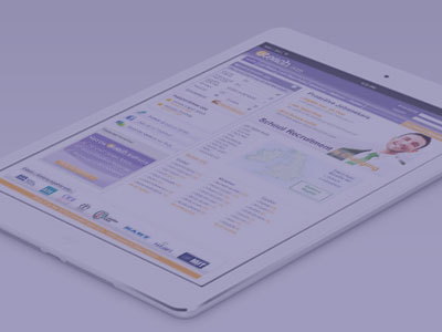
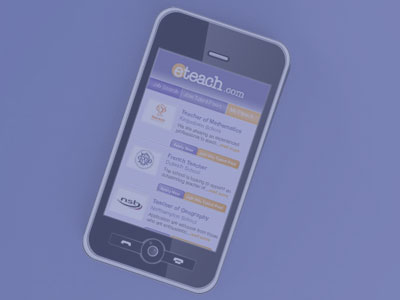
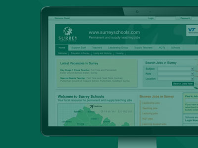
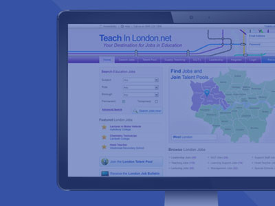
Eteach had an out-of-date website which lacked user interactivity. The challenge was to not only design a website that would ensure visually Eteach could compete with the big players in education such as the TES and the Guardian, but to also consider pushing the boundaries in regards to candidate and recruiter needs. The Eteach website had not been updated for 10 years when I first began at the company and my first objective was to work closely with the CEO, Marketing Manager, Commercial Director, Sales Team and Marketing Department to prioritise the key objectives for the website implementation and response. The website required a complete redesign from front-end branding to back-end functionality. The website firstly needed to work well as a search engine, allowing the user to find jobs easily through specific criteria or allow general keyword search capacities. The key search areas are the homepage, International, Indepedent and Temporary pages. These pages allow the users to search, register, access tailored resources and information, quick links to other sites such as the blog and SEO quick searches for key words and areas. In addition I also needed to consider advertising space that would not detract from the website objectives and usability and work as a stream to generate revenue from partner advertising and sales.

The other critical areas of focus were the candidate and recruiter bespoke areas of the website. Each recruiter is able to have a standard profile or 'Premium' profile which details the jobs available, school information, local directions and multimedia area all in once succinct space. Recruiter have their own login 'Dashboard' area which allows them to easily 'Add a Job', 'Manage Jobs', 'Manage job Distribution', 'Manage Applicants', 'CV Search', 'Manage Talent Pools', 'Manage Account', 'Book Supply'. The dashboard was broken down into its simplest form to allow the user to have quick, easy access to all the varied core components. For the candidates, a 'My Eteach' area was required that allowed the user to 'Manage their Profile' and control all their search, job, bulletin and message alerts. The Eteach website has such a vast array of functional requirements is was key that these were considered and developed with the target audience in mind.

I was responsible for thorough analysis of the current Eteach website including meetings and coordination with the CEO, Marketing Manager, Commercial Director, Sales Team and Marketing Department to prioritise the key objectives for the website implementation and response. Creating a structure and project plan for the design and build. The new website was a complete rebuild and design taking into account key competitor offerings, candidate and recruiter bespoke areas, sales tactics and user generation. I completely redesigned the whole website breaking down each area into categories and creating bespoke pages for each area. Each page was redesigned, critiqued, and reviewed in order to achieve the best offering and value for each area. I worked closely with the Technical Department and Development Manager to review functionality, CMS backend requirements and accessibility values. Each page was designed, cutup in HTML/CSS and then implemented in the development.

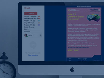
In addition, work and attention was paid to SEO and the implementation of analytics and the Eteach adserver to ensure browser transparency and optimisation. Email campaigns are bespoke and driven through communicator and a tailored Eteach email system to ensure messages are intuitive and relevant. All emails are run through the spam filters and email content checkers for all email systems which are checked and tested thoroughly.

The Eteach website is constantly evolving and the core intention is to ensure a smooth and dynamic recruitment process for the candidate and recruiter. The candidates have access to a tailor-made 'My Eteach' area which allows the user to run and update their profile accordingly as well as being in control of search, messaging and bulletin alerts. The recruiter area is more complex as it allows for multiple users from schools and colleges to manage jobs, add job postings, tailor their online recruiter premium profile, and manage applicants through the whole process from shortlisting to interviewing to allocating to Talent Pools. Beyond this, there are mini portals that manage CV Search, online advertising, press advertising and supply pool bookings. It is my responsibility to ensure the usability and interactivity remains intuitive and at the forefront of technology.

Eteach App

Creation and Planning

Eteach was running a successful recruitment website focusing on the education sector. The time was right to create their first app, this app would be a tool for job hunters to search jobs and manage their applications through their members login area.

This project was initially kicked off working with an app development agency, we then decided to build this in-house instead. I was responsible for the site-mapping, user flows, project specifications and planning. Working with the development team, I owned the design and initial build and worked with the dev team to ensure that the functionality followed the specifications and met user testing standards and quality assurance.

Eteach

Sponsorships, Exhibitions and Collateral.

Eteach is a successful recruitment website focusing on the education sector. Eteach liked to invest in sponsorship opportunities to support sport teams such as Swansea FC, London Irish and the Women's Hockey league. As a result of this we often we allowed to have branded sponsors hoarding at the stadiums, adverts in the programs and our logo on the team kits. The largest branded banner I worked on was 72ft long for the Swansea Stadium! With such hoarding, clarity is key, so the best results are often simple and straight-forward branding.

In addition, I was required to produce various stands, popup stands and booths for exhibitions and printed collateral for hand-outs, business packs, magazine adverts and press publications.

eConnected

Social Network Design

Eteach wanted to increase candidate generation as well as providing existing candidates with an area they could use and develop as a career networking website. eConnected is a social media platform specialising in connecting education professionals with new opportunities to develop their career and training. eConnected is an education online social media forum and networking resource for schools, colleges and teachers. This platform enables candidates to effectively search jobs, education news and opinions, create an online profile as well as registering their interest with future employers. The benefit for schools is they can have a wide stream of visibility for future and prospective teachers thus streamlining the recruitment process.

I owned the planning and structuring the website objectives and deliverables from the offset. Designing core template screens for the login/signup process, to profile pages, to forums and posts. Implementing design build, back end structure and add-ons/widgets.

Ramada Jarvis

Email Campaigns

Ramada Jarvis wanted to launch a new email campaign highlighting their latest services and a special promotions. The email campaign goals were to increase user CTR and drive active engagement to investigate the promotion further.

I was leading the initial conceptual design for email campaign working with Ramada Jarvis corporate branding, including contact with client to discuss design requirements and email objective, and I implemented the HTML cutup and build ensuring compliancy and email server compatibility.

Surrey County Council

Education Website

Surrey County Council Schools site was disconnected from the council branding, therefore the key emphasis on the redesign for this site was to ensure there was a strong brand connection allowing users to trust and recognise the education site. Initially working as a content based site the regeneration allowed me to make the site more functional and beneficial to the user as a core search engine for Surrey Education.

I ran the kick off meeting with Surrey County Council Education Team. I then began investigation into client requirements with own suggestions and recommendations for improving the layout, look and usability. Then I could start the initial conceptual design working with the Surrey County Council branding as a guideline, including contact with client to discuss design requirements and website objective. I re-designed the relevant site pages and functionality, then led the HTML/CSS cutup and build ensuring compliancy and browser compatibility.

Poochy Pals

Small Business Package

Poochy Pals is a small start-up local business. As a business focused on dog day care they needed a digital presence that appealed to the local community of dog owners to help spread the word and ultimately join or endorse their club and services.

Working alongside the business owner I developed a simple minimal website which had all the right information displayed in a simple easy to read format that was not overwhelming for the customer, they also needed a contact form and an image gallery. I then set up their social media presence on Facebook with company pages, which is their main route of advertising and promotion. I trained the business owner to understand best practice on Facebook and how to compile engaging social posts to encourage social sharing and promotion. I also set up their Google business identity and added them to other directories such as yell etc. Then I designed their registration forms in InDesign and flyers for the local area. I helped them develop their brand identity including producing business cards and workwear. Small businesses such as this are a pleasure to work with as you have to think of innovative digital channels and growth hack strategies to raise brand awareness as there is little budget to spend. So ensuring that any digital content is developed with best SEO practice in mind is also vital to aid organic growth.

FEjobs

Creation and Planning

FEjobs is a sister site to Eteach. This website was also out of date and in need of a revamp to ensure the website was an up-to-date tool in the education recruitment marketplace. As the website is a sister site to Eteach the design was more of a re-skinning process as well as considering area enhancements that would benefit the FEjobs site. It was still important the FEjobs retained its own identity to appeal to colleges and lecturers, so there was a recognised identity they could refer to for their recruitment requirements.

As this is a sister site to eteach.com, and the functionality, structure and build is almost identical. The key was to update the FEjobs website with the new 'eteach' structure but to create a strong FE brand. This website required new designs for all imagery so the colours, logos and branding represented the FE identity. I designed all the core pages with the new branding and cutup the designs and saved the new images for the website and implemented a new bespoke CSS for the backend. in addition new FEjobs email campaigns and bulletins were also designed and implemented.

I also developed the brand as much as I could within the guidelines, and created a variety of company collateral, exhibitions stands, adverts, flyers and hand-outs.

Crown Paint

New Modernist Range

This was a branding exercise for a conceptual range of Crown paints inspired by the modernist movement. A strong theme of the avant-garde and the movement of wanting to create, improve and reshape your environment was an ideal ethos for this exercise. The brief was to create a paint swatch brochure and an advertising poster.

I researched and explored the modernist era from art to movements to politics. And one of the intriguing things I discovered was the first diagrammatic map of the underground was designed by Harry Beck in 1931. Harry Beck's tube map is a London icon and a masterpiece of design, the map has become a design classic, implicitly demonstrating the importance of simplicity, economy and utility – all key values promoted by modernist design. I used this as my initial inspiration and I liked the play on meanings for the word 'tube' as in tube map and tube of paint. From this concept I designed a leaflet which had a strong resemblance to the design ideals and authority of the tube map but with a human twist that personalised the imagery and made the lines become lines of colour leading to the paint names as stations. The theme of line art was used to simplify photos of lifestyle, almost like a colouring in book, all the elements seem to spark a new idea until they worked together, leaving the reader to colour in the blanks with what colour suited them from the paint palette swatches.

Crown Agents

Website Redesign

Crown Agents required a new site design that was flexible enough to work with all the sectors of the organisation. This site design has large banners to help the user decipher which area they are in as well as ensuring the navigation and right hand panels led the user to the correct related information.

I owned the initial conceptual design including contact with client to discuss design requirements, and the HTML/CSS cutup and build ensuring compliancy and browser compatibility.

Mantana (SAP)

Partner Training Tool

SAP required a website for a faux communications company called 'Mantana', the aim was for this website to be used as a Sales testing and training tool for SAP staff and resellers. The website needed to work for each training level, therefore the options available span from beginner to expert seller status. The initial outline for this Salesforce training tool was very basic. The general text content was provided but the actual structure and design was not set. Therefore I had free reign on the website and how the content could be displayed in order to appear like a cohesive company website, this in turn provided a purposeful case study for SAP to train staff and partners the corporate sales expectations and process, based on a generic company. This website and the sub sites, which are password protected for pubic/partner/professional, were solely managed, designed and built by myself. The result was incredibly positive feedback for SAP as to how this enhanced the training process.

Initial discussion and planning with SAP Partner Manager and Director regarding the objective and basic outline. This was a solo project so I had complete control over the design, structure, layout and content; which I planned and designed before presenting to SAP for sign off. I was solely responsible for the design, build and functionality of the complete product, this included initial conceptual design, Mantana branding, HTML/CSS cutup and build ensuring compliancy and browser compatibility.

Teach in London

Digital Identity and Promotion

Teach in London was an idea conceived by the Eteach group, who wanted to target a specific demographic with a tailor-made site that would appeal to candidates and institutions in and around the London area. The website was to keep the core functionality of the Eteach website, but the challenge was to enhance the website with a new look and its own brand identity to differentiate between the two product offerings. The website was designed with a fresh look and feel and i designed all the branding elements including the logo and underground style illustration.

I was responsible for meeting and coordination with the CEO and Marketing Manager to prioritise the key objectives for the website implementation and response. Creating a structure and project plan for the design and build. The new website was a complete rebuild and design taking into account key competitor offerings, candidate and recruiter bespoke areas, sales tactics and user generation. I worked closely with the Technical Department and Development Manager to review functionality, CMS backend requirements and accessibility values. Each page was designed, cutup in HTML/CSS and then implemented in the development stage.

In addition, work and attention was paid to SEO and the implementation of analytics and the adserver to ensure browser transparency and key word optimisation. Email campaigns are bespoke and driven through communicator and a tailored Eteach email system to ensure messages are intuitive and relevant. All emails are run through the spam filters and email content checkers for all email systems which are checked and tested thoroughly.

Yatteiru Zo

Printed Collateral

Yatteiru Zo is a pop-up, contemporary sushi restaurant in London that needed a image that conveyed the bright yet relaxed atmosphere of the pop-up restaurant, a haven in the city for cool contemporary food. They required a new logo, brand identity, menu and invitation, the brief stated 'food for a manga soul'.

I created a new brand identity for Yatteiru Zo. This involved the initial logo design, which was designed in illustrator. I then designed the main imagery of the Yatteiru Zo girl (Japanese icon), which would be the brand identifier. I designed collateral for the restaurant including a 3-fold B2B menu and launch night invitation.

FCS

Printed Collateral

FCS work with all sectors to ensure safety and compliance are achieved in the workplace, as the business is growing and taking on large contracts it was clear the brand needed a quick identity overhaul and a simple selection of collateral to secure credibility with sales prospects.

I designed stationary, flyers and popup stands as well as being involved in the development and design of the company website.

Edexcel

Email Campaigns

Edexcel required some simple email blast campaigns that shared their latest promotional messages or notifications, whilst adhering to their brand guidelines and ensuring the emails had a striking impact.

I was responsible for the initial conceptual design working with edexcel corporate branding, including contact with client to discuss design requirements and email objective. I was also responsible for the HTML email cutup and testing ensuring browser and email engine compatibility.

London Irish

Sponsorship Campaigns

London Irish Rugby Club worked in partnership with the Eteach. As part of the sponsorship, London Irish had their own section on the Eteach website which adhered to their brand identity, to promote matches, as well as child fitness programmes such as matchday masterclass, and the healthy schools programme. The webpages needed to work as a concise portal which would navigate the users to core areas on their website. In addition there were email campaigns that helped to boost awareness and promotion of the various club offerings.

I was responsible for the initial conceptual design, HTML/CSS cutup and build ensuring browser compatibility, and email branded campaign design and implementation to match and suit messaging and PR.

Painted Letters

Font Design

The 'Painted Letters' font originated from initially a hands on experience of letter writing with mixed medium. The creative process was the alphabet dripped onto cartridge paper with heavy oiled inks. This was then traced into Illustrator. In Illustrator, I tidied up the raw vector shapes to perfect the shape and angles for each letter, although obviously the hand written painted element had to be somewhat retained in order to maintain the effect. These vector shapes were then processed through fontographer to produce a final working font.

British Expertise

Website Redesign

British Expertise had clear objectives for this website. It was priority that a member's area should be prominent, and should become an area that new visitors desired to be part of. The content on this site was broken down into several key functions: News, Events, Projects and Profiles. These sections all required simple easy-to-use lists and archive lists so the users could be up-to-date on the latest British Expertise endeavours.

I would conduct client and company meetings to gain an in-depth understanding of the clients goals. Analysing the company requirements to ensure correct sitemap and proposal objectives are catered for. I then led and managed the initial conceptual design, HTML/CSS cutup and build ensuring compliancy and browser compatibility. Going forward I created a design brief for increasing customer engagement by developing a company email and newsletters plan, driving email targeted campaigns to new customers and current members.

Skoda

Brand Conceptual Design

This was a conceptual brief to redesign a successful logo in the marketplace. I chose Skoda as historically the label 'Skoda' was one of mockery and jest, until recent times when the machines performance and popularity has now quashed the poor reputation of the Skoda brand, therefore I needed to create a new logo/brand image that would reflect the new success of Skoda.

Throughout history, logos change and adapt to reflect the business and product. A new logo can symbolise growth, redesign and progression. The Skoda logo has adapted greatly over the years, and I think the current logo is actually a good reflection and identifier of the Skoda brand. However the question was how to improve on this, I wanted to break the latest logo down to its core elements, simplifying the logo so it became a visual prompt for the brand instead of needing the brand name as a label. For an element such as a car badge, it can be read like a stamp, why should a stamp need too much detail, if the main elements are strong enough, the need for text should be eradicated and this was my intention, to strengthen and simplify.

Contact me

You can reach me at sally@graphic-designer.com or call me on 07917 034451, you can also find me on Linked In.

Or if you are feeling particularly stalky you can follow me on twitter or instagram @create_28.